Highlight Domains
Overview
From its inception, Highlight was designed for multitenancy. Providers and consumers of managed IT services share information using a single pane of glass and collaborate secure in the knowledge that each user can only see the data they should see.
Highlight Domains builds on our multitenancy functionality by allowing consumers of IT services from more than one provider to see all their services with a single Highlight login and a simple switch between provider domains.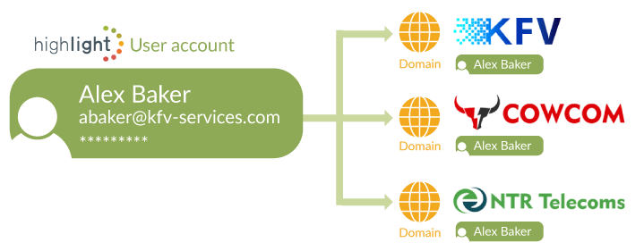
Domains - your multi-channel single pane of glass
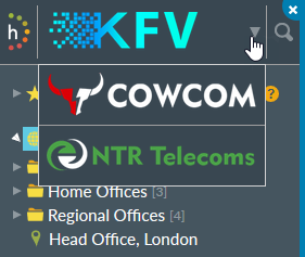
Providers can choose whether consumers accessing their provider domain URL can switch to other domains or not. It is also possible for consumers to create their own domain to monitor services from providers who do not currently offer Highlight.
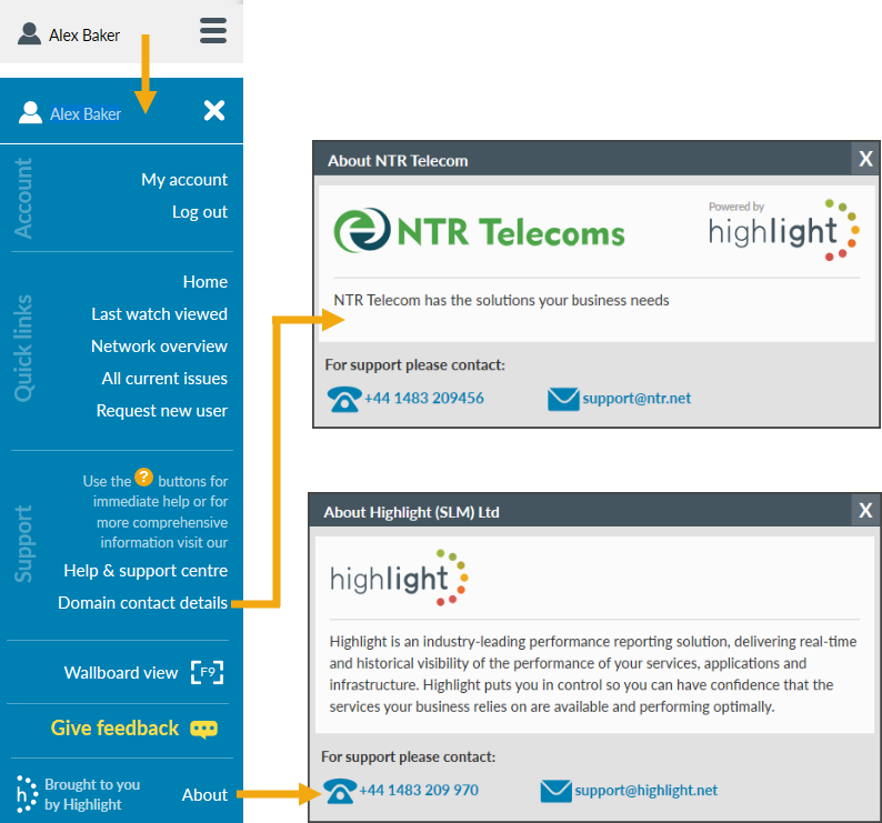
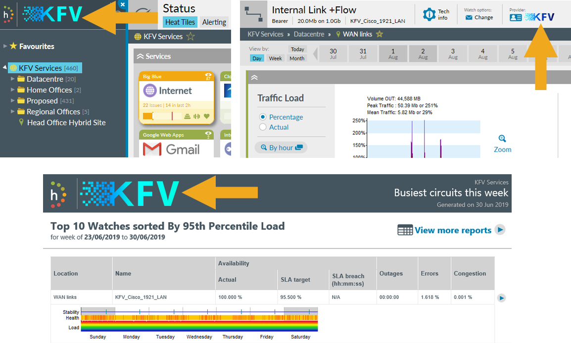
With domains you can login once via your own custom branded folder (for example, KFV Services) and use the drop-down in the top left to switch between your own services and those from other providers (CowCom and NTR in this example).
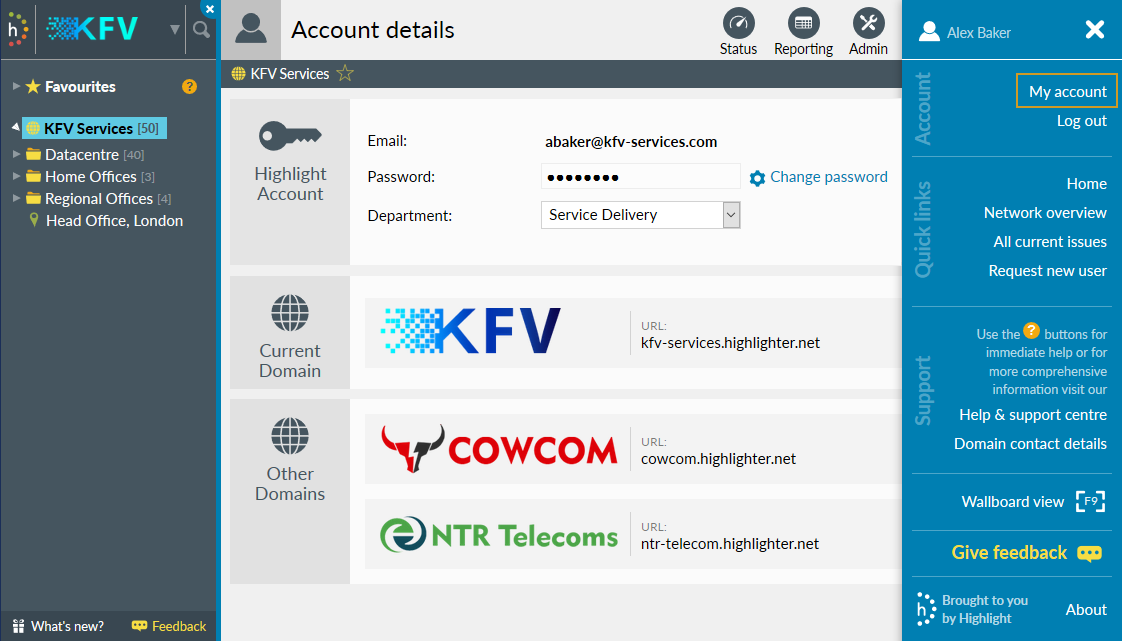
The Account details page lists the current domain and other accessible domains, including logo and URL(s).
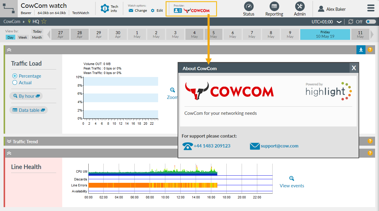
When viewing any individual service, the logo at the top of the page shows the provider. Clicking on this logo gives immediate access to the provider contact information.
Provider contact information can also be accessed from the Domain contact details in the user menu side bar, whilst the About panel shows Highlight contact details.
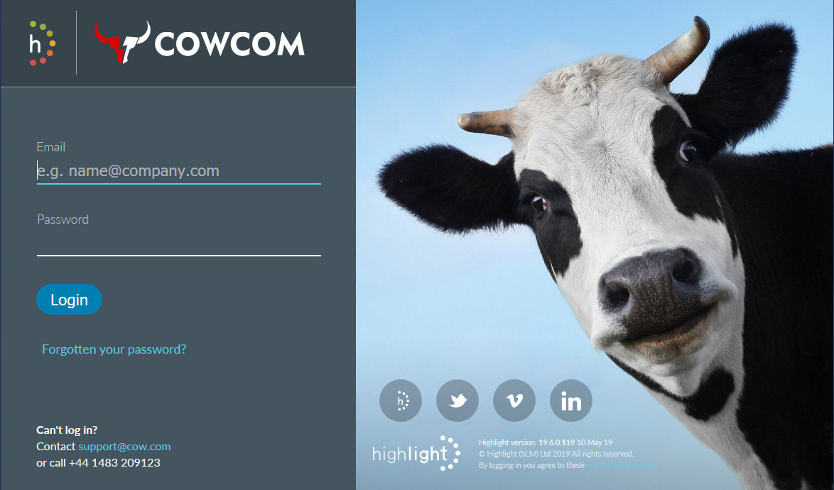
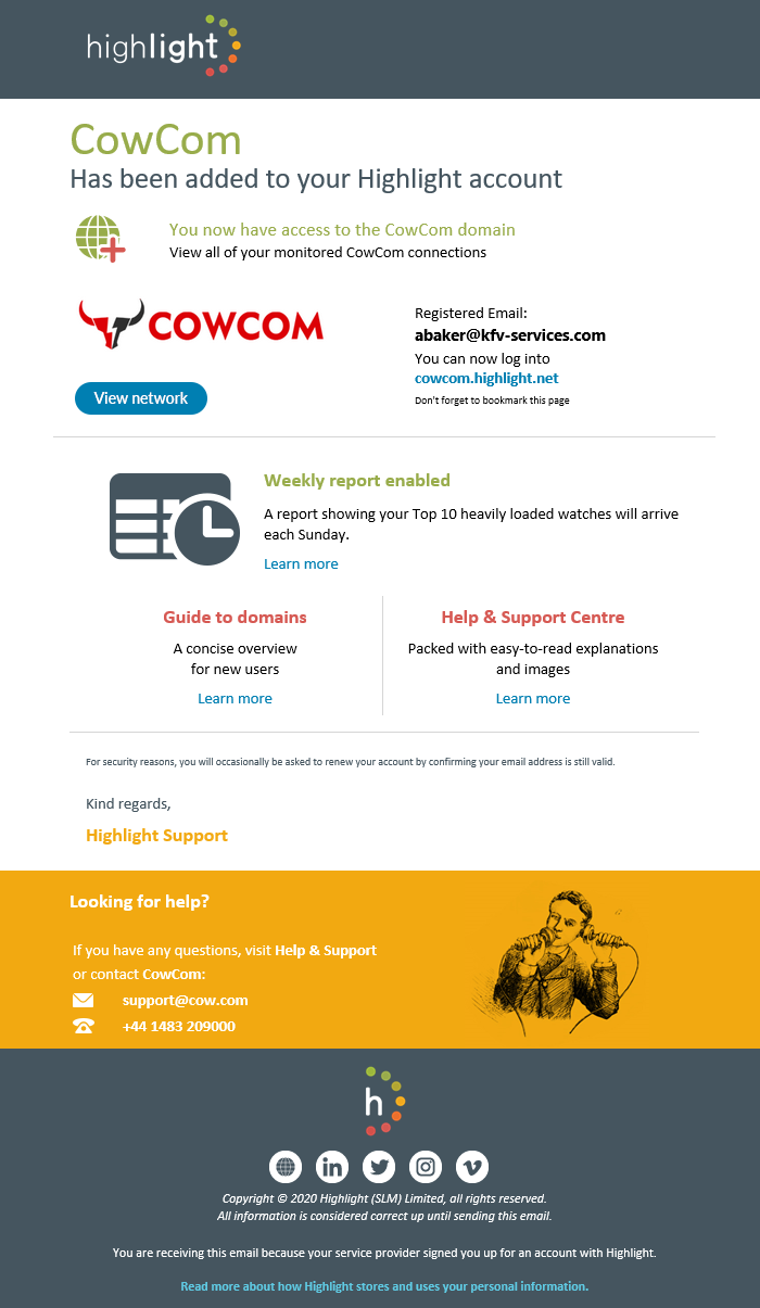
Custom domain branding is also available on the login page and in user emails.
Contact us if you'd like to start using domains.
Domain branding
Domain Branding Guide
This information is also available as a PDF
Highlight gives you an easy way to customise your domain to provide a fully branded portal to your staff and customers.
Customisable elements
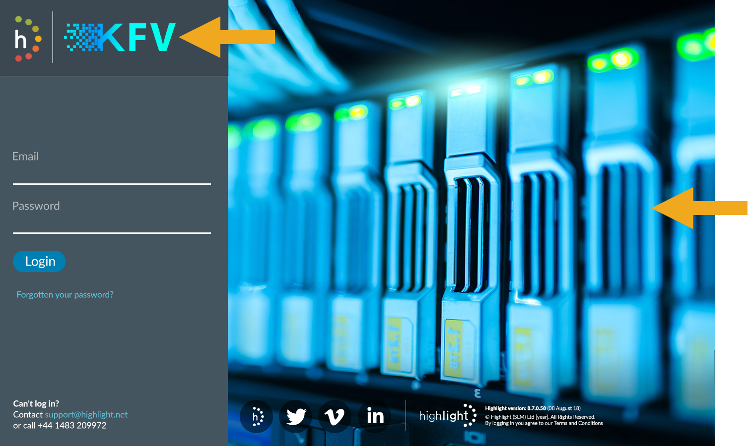
*User welcome emails, expiry emails and scheduled reports
What we need from you
Login background image

Image guidelines: Due to the responsive nature of the page that allows Highlight to look great on all screen sizes and the left hand side bar covering part of the image, we cannot control how much of the image will be displayed. We strongly suggest avoiding text entirely and keeping the most important parts of the image in the centre right.

Logo

We use the logo in both full and compact versions on light and dark backgrounds. The minimum we require is a single large logo (min 300 x 62px). If you wish to specify how the logo looks at compact size or on both dark and light then please do so. Vector based formats are best (.ai, .eps, svg) but we can accept any format. There is also space for an optional secondary logo, for use by a parent organisation, for example, which appears next to the small print in the bottom of the login page.
Social media links

By default the login screen displays links to Highlight social media pages. Currently these are not configurable but can be turned off completely.